Responsive Menu for WordPress: Control the Mobile User Experience
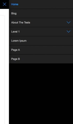
The IntelliWidget Responsive Menu lets you break free from your theme’s built-in responsive menu options and gives you complete control over the user experience.
Inspired by jQuery Mobile’s panel functionality, it uses its own lightweight (6k) jQuery library to accomplish a similar effect without the custom coding required for a jQuery Mobile site.
A Responsive Menu Plugin Designed for Flexibility
Why use the IntelliWidget Responsive Menu?
- Works with virtually any theme – designed for flexibility
- Pre-configured for many popular themes (including the default WordPress themes back to Twenty-Ten)
- Lightweight JavaScript (<6k minimized)
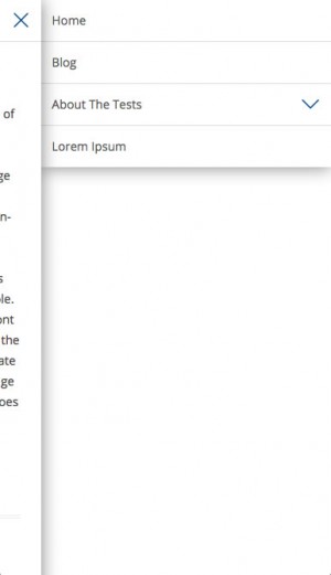
- User interface similar to native mobile apps
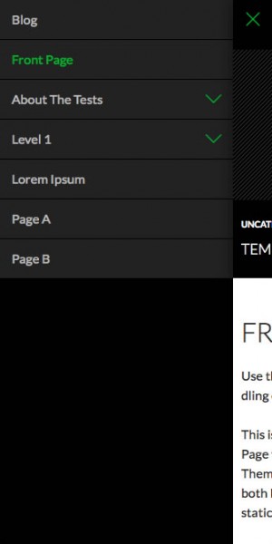
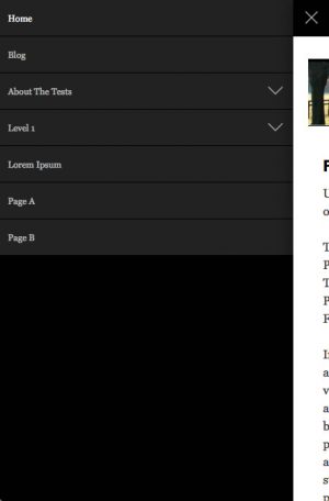
- Automatically generates accordions for submenus – only top level pages are shown initially
- Uses actual rendered menus from the page – including automatic page menus not associated with specific WordPress Nav Menus
- Create your own header and footer content or use content that exists on the page
- Overlay, Push and Reveal animations from left, right or top of page
- Lots of pre-configured styles to choose from
- Easily customized using our Child Theme Configurator
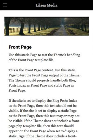
Twenty Fourteen
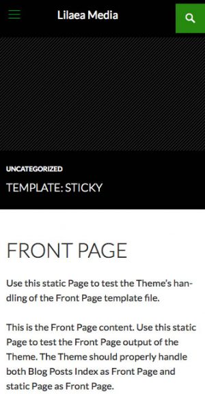
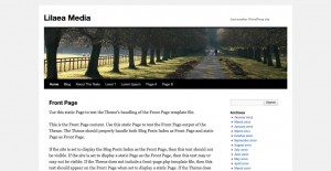
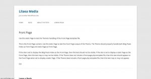
It even works with older, non-responsive themes like Twenty-Ten:
For a lighter feel use the White/Blue option with Twenty-Twelve:
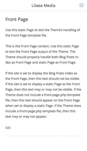
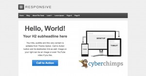
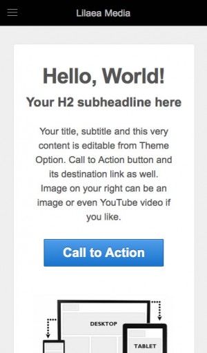
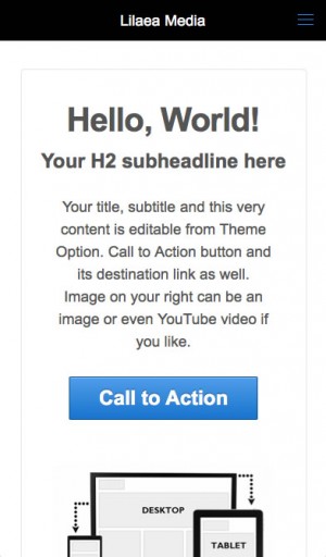
Even themes that are already responsive see the benefits:
Installation
- Download the IntelliWidget Responsive Menu plugin from LilaeaMedia.com
- In the WordPress Admin, go to “Plugins > Add New.”
- Click the “Upload” link at the top of the page.
- Browse for the zip file, select and click “Install.”
- In the WordPress Admin, go to “Plugins > Installed Plugins.”
- Locate “IntelliWidget Responsive Menu” in the list and click “Activate.”
Responsive Menu Options
The ease with which the Responsive Menu is configured and the effectiveness of its execution depends heavily on the design of your theme. If your theme conforms to the guidelines described in the WordPress.org Codex, it should play nicely with IntelliWidget Responsive Menu. Here are the options available for customizing your Responsive Menu:
Break Point for Responsive Menu
Enter the width (in pixels) at which point the display changes to the handheld menu.
Header Style
There are several color combinations available to suit many popular themes. You can customize the header by overriding the styles in your theme\’s style.css file.
Animation
There are three animations available, inspired by jQuery Mobile: overlay, push and reveal.
- Overlay: The panel slides over the main panel.
- Push: The panel slides into the viewport, pushing the main panel outside.
- Reveal: The main panel slides out of the viewport, revealing the Responsive Menu behind it.
Menu Origin
Overlay Animations can originate from the top, right or left. Push and Reveal animations can originate from the right or left. If \’top\’ is selected, the Menu will automatically use the \’overlay\’ animation.
Additional Header Source
You can automatically display the Site Name or Header Image (if your theme supports it) by selecting it here.
Menu selector
This setting determines the menu that is used to render the Responsive Menu. Enter the CSS selector of the primary Navigation Menu here.
Selectors to hide
The Responsive Menu replaces most of what usually appears in the header section of your site. Enter the CSS selector(s) of any content containers you wish to hide from the main panel.
Header Custom HTML
You can add your own markup to be injected into the header by entering it here. Remember that space is limited.
Footer Custom HTML
You can add your own markup to be injected into the footer by entering it here. Remember that space is limited.
Selectors to copy to header
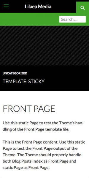
You may wish to display additional header elements, such as a search box, in the menu area. Enter the CSS selector(s) of any content containers you wish to copy to the menu header, keeping in mind that space is limited. Elements will be displayed in the order they are entered, left to right, top to bottom.
Selectors to copy to footer
You may wish to display some footer information, such as contact info, in the menu area. Enter the CSS selector(s) of any content containers you wish to copy to the menu footer, keeping in mind that space is limited. Elements will be displayed in the order they are entered, left to right, top to bottom.
Classes to remove from menu
Some themes use their own CSS classes to enhance the navigation. Enter any classes that need to be removed to create a baseline WordPress Nav menu.
Selectors to automate width
Some themes may not use a responsive design. You can make many of them responsive by removing fixed widths from various container elements. Enter the CSS selector(s) of any content containers you want to use automatic width.
Selectors to remove float
Non-responsive themes do not remove floats of container elements for smaller viewports. Enter the CSS selector(s) of any content containers from wich you wish to remove the float attribute.
Scripts to dequeue
Some themes utilize scripts to enhance the menu functionality. Select any scripts that interfere with the Responsive menu and they will be removed from the script queue.
Width visible after animation
For left and right push and reveal menus, this setting determines the amount of the main panel to leave exposed. A setting no lower than 48 is recommended.
Use Touch-Punch jQuery Plugin
This jQuery library converts mouse events into mobile touch events. If it is already being used by your theme, uncheck the box.
Add Viewport Meta Tag
Check this box if your theme does not automatically add a viewport meta tag. This tell the device to wrap the content rather than scaling the page when it exeeds the device-width.
Reset defaults
IntelliWidget Responsive Menu supports many popular themes (including the default WordPress themes back to Twenty-Ten). Checking this box will auto-detect your theme and populate the options if it is supported.
Update Key
Enter the Update Key that came with your purchase to receive update notifications and to enable downloads of newer versions.
Theme Default Presets
Frequently Asked Questions
How do I make my Theme responsive?
Some common characteristics of responsive design are:
- Avoiding fixed width and height values. Using max- and min-height values and percentages are ways to make your designs respond to the viewer’s browser size.
- Combining floats and clears with inline and relative positions allow the elements to adjust gracefully to their container’s width.
- Showing and hiding content with Javascript.


